A logo can look sharp on a phone but appear blurry when printed on a large sign. Preparing print-ready artwork for signs means checking more than the file name or extension. The artwork must suit the final product, printed size, viewing distance, and production process.
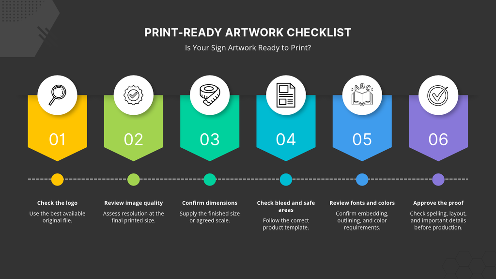
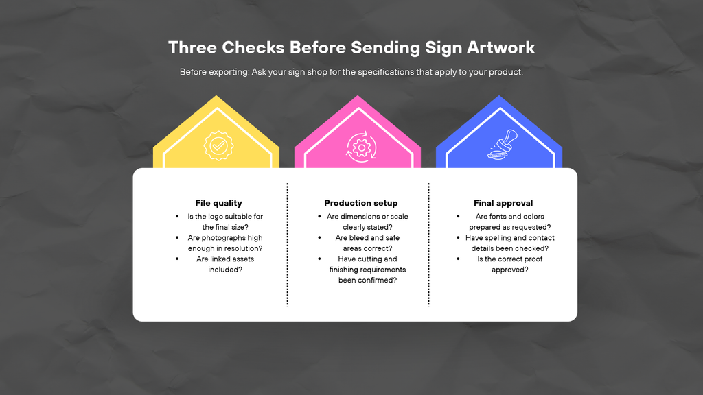
The essential checks include correct dimensions or a stated scale, suitable logo and image files, required bleed and safe areas, reliable fonts, and agreed color settings. A PDF can still contain low-resolution images or other issues that need correction. Ask your sign shop for product-specific requirements before exporting your files. If you cannot find the original logo or need help preparing a design, ask about available design assistance before sending the artwork for production.
What counts as print-ready artwork for signs?
Print-ready artwork meets the technical requirements for the specific sign being produced. It should have the right dimensions or scale, suitable image quality, correctly prepared fonts and colors, and any required bleed or cutting information.
Three types of files serve different purposes:
- Editable source files: Original design files that allow changes to text, layout, colors, and other elements.
- Production exports: Files prepared for printing or finishing, such as an approved PDF.
- Approval proofs: Versions used to check the design, spelling, layout, and other visible details before production.
Changing a file extension does not change the artwork itself. For example, saving a low-resolution image inside a PDF does not turn it into vector artwork. The file must meet the actual production requirements, not simply use a preferred format.
Which logo and image files should you send?
A genuine vector logo for signs is often useful because vector artwork stores shapes and paths rather than relying entirely on a fixed grid of pixels. This allows vector elements to be resized without the same pixelation associated with enlarging raster images.
Raster files, including photographs, use pixels. They can work well for signs when their resolution is suitable for the intended printed size.
Common formats include PDF, AI, EPS, SVG, PNG, and JPEG. However, the extension alone does not confirm suitability. A PDF, AI, EPS, or SVG file can contain raster images, and some files may have missing fonts or linked assets.
Before sending files, check that:
- The logo is the best available original, not a screenshot copied from a website.
- Photographs have enough resolution for the final size.
- Linked images and other design assets are included where required.
- The sign shop accepts the file format and can access its contents.
If you work with an agency or external designer, ask them to supply the production file and retain the editable original. For agency handoffs, large-format production support can help connect file preparation with the wider production process.
How do size and resolution work together?
Image resolution must be assessed at the final printed size. An image that looks clear on a laptop may become visibly pixelated when enlarged for a banner, panel, or vehicle graphic. The key question is how many pixels will be available across the area being printed.
For example, an image that is 3,000 pixels wide and printed at 30 inches wide provides 100 pixels per inch (PPI) at that size. This is a calculation, not a recommendation or a guarantee of acceptable print quality. The right resolution depends on the image, output method, viewing distance, and sign shop requirements.
Illustrative example: A business has a small logo downloaded from its website and wants to use it on a large display. Enlarging that file may reveal rough edges. Requesting the original vector logo or a higher-quality source could provide a better starting point.
Before exporting large format print files, confirm the final dimensions and any scale convention with the printer. Avoid assuming that every sign needs the same resolution or that a universal 300-DPI setting will suit every project. Sign printing resolution should be assessed in context.
How should you handle bleed, safe areas, and cut paths?
Bleed, trim, and safe areas help ensure that the finished sign looks as intended after cutting or finishing.
- Trim: The intended edge where the finished printed piece will be cut.
- Bleed: Extra artwork extending beyond the trim edge to help prevent unwanted unprinted edges after cutting.
- Safe area: The space inside the trim where important text, logos, and other essential content should remain.
The required setup varies by product. A banner may need different allowances from a rigid panel, vehicle graphic, or contour-cut decal. Do not apply one bleed measurement to every job.
Use the sign shop’s supplied template when one is available. For a display, check that the artwork accounts for the hardware and visible panel area. The trade show display graphics page is a useful starting point when preparing artwork for a display system, but the exact template and specifications should still be confirmed for the selected product.
For trailer graphics, consider how doors, seams, handles, and other physical features affect the layout. Important text should not accidentally fall across a gap or into an area that may be obscured when the trailer is in use.
If the design includes a custom cut path, ask the printer how it should be supplied. Confirm the required setup rather than guessing a spot-color name, line weight, or file convention.
What should you check for fonts and color?
Fonts and color settings can change how artwork appears when opened or printed on another system. Check them before submitting the final production file.
For fonts, ask whether they should be embedded in the PDF or converted to outlines. Embedding can preserve font information within a supported PDF, while outlining converts text into vector shapes. Outlined text is less dependent on the recipient having the original font installed, but it is no longer directly editable as text. Keep an editable original before making that change.
Color also needs attention. Colors displayed on a monitor may look different when printed because screens and printing processes reproduce color differently. The result can depend on the artwork, material, inks, and production workflow. If brand colors are important, provide the relevant color values and ask the shop how they should be prepared.
Adobe’s guidance on producing print-ready PDF files explains print preparation concepts such as preflight and bleed. Use software guidance alongside the sign shop’s specifications. It does not replace product-specific instructions for color profiles, fonts, or export settings.
What belongs in your final artwork handoff?
A complete handoff helps the sign shop identify the correct files and check them against the intended product. Use this sign proof checklist before sending artwork for production.
- Project name: Label the job clearly so the correct files stay together.
- Dimensions and scale: State the final size and explain if the artwork is supplied at a reduced scale.
- Current artwork: Include the latest production file and retain the editable original.
- Linked assets: Supply any external images or other assets the design needs.
- Template: Confirm that the artwork follows the correct product template.
- Quantity and material: Identify the intended quantity and sign material, if known.
- Finish and cutting: Note any required finishing or contour cutting and confirm the setup with the shop.
- Final proof: Review the proof for spelling, contact details, layout, colors, and important elements before approving it.
Do not stretch a screenshot to fill a larger layout when the original asset is missing. Flag the issue and ask whether a better file or design assistance is available.
For agencies and in-house marketing teams, keep the handoff organized by project and version. Clear file names and one identified final version can help reduce confusion when several people contribute to a design.
Conclusion
Preparing print-ready artwork for signs starts with understanding the finished product. Check dimensions, image quality, fonts, color, bleed, and any cutting requirements before exporting the production file. Confirm the sign shop’s specifications rather than relying on a generic online checklist or assuming that a PDF is automatically ready to print.
Keep your editable originals and review the final proof before giving approval. If you are preparing signage for a business in Sarasota or the surrounding area, Sarasota Sign Shop can review your artwork requirements and discuss design assistance if you need help preparing files for production.