The best font for outdoor signage in Florida is one that is bold, simple, high-contrast, and readable at speed. Thin, decorative, or script fonts may look attractive in a logo or brochure, but they often fail in real-world visibility conditions — especially under Florida’s intense sunlight and along busy roadways. When drivers pass a storefront or plaza, they typically have only a few seconds to read and process a sign.
Typography often has a greater impact on readability than color or graphics. Unfortunately, many businesses choose fonts based purely on aesthetics rather than visibility. The result is signage that looks good up close but becomes unreadable from the road. Effective Sarasota signs are designed with distance, glare, and traffic speed in mind. Sarasota Sign Shop approaches sign typography with these real-world factors at the center of the design process.
Why Font Choice Matters More Than Most Businesses Realize
Drivers traveling between 35 and 50 mph typically have two to four seconds to notice and read a sign. During that brief window, the brain must identify the business name, understand the message, and determine whether to turn into the location.
If the font is too thin, crowded, or decorative, the message may never register. From a marketing standpoint, that means lost customers.
Typography also affects brand perception. A clear, confident typeface communicates professionalism and stability. A cluttered or outdated font can unintentionally signal the opposite.
For businesses relying on street traffic, legibility is directly tied to performance. Every passing car represents a potential customer, and readable commercial signage Sarasota businesses install can significantly improve awareness.
In short:
Readable signage → More impressions → More visits → More revenue
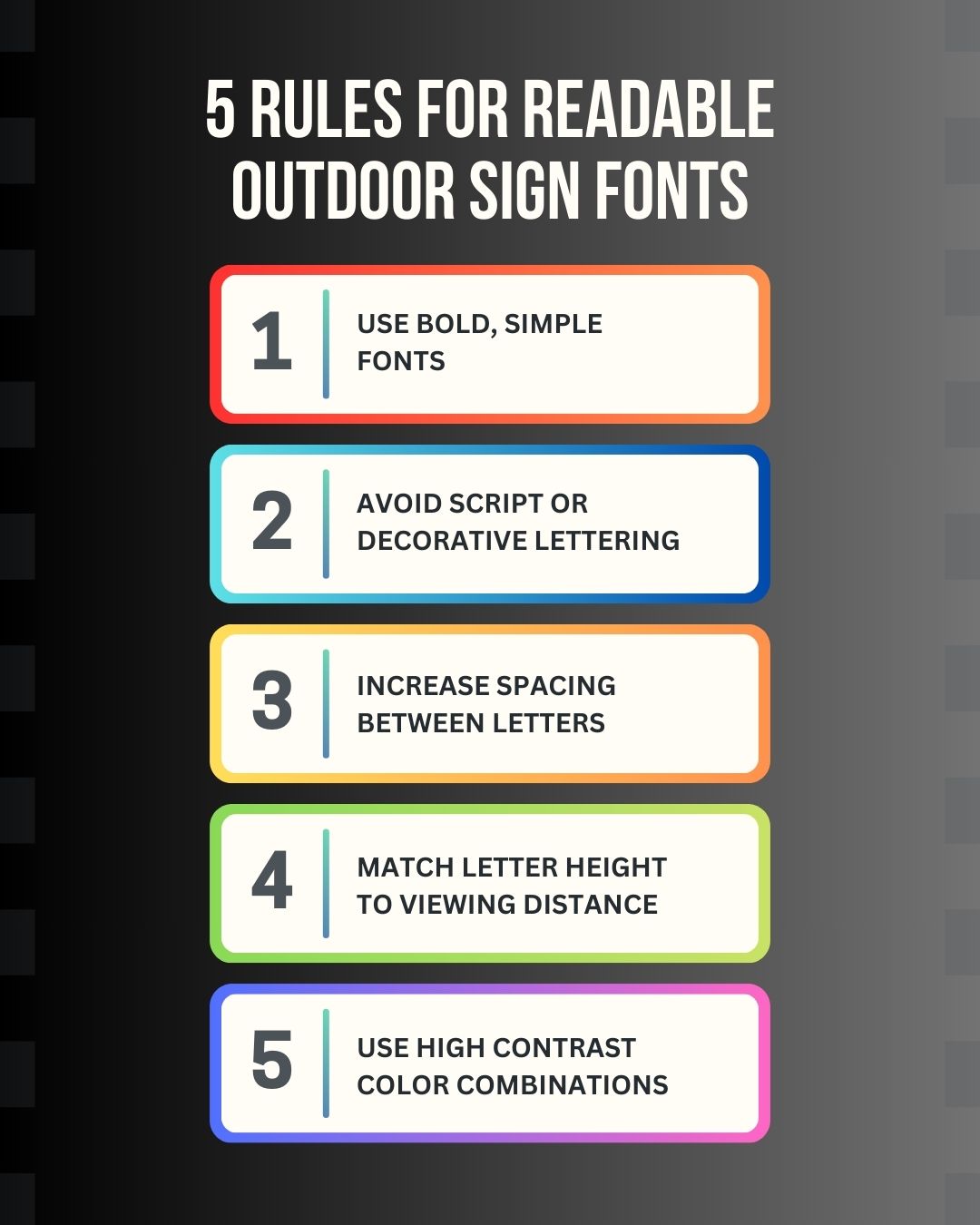
The 5 Rules for Choosing Fonts for Outdoor Signs
Designing readable fonts for signs requires different rules than designing for print or digital media.
Choose Bold, Clean Letterforms
Fonts with thick strokes and simple shapes perform best outdoors. Sans-serif fonts are widely considered the most effective for signage because they maintain clarity at long distances.
Common characteristics of effective business sign fonts include:
- Thick, consistent strokes
- Simple letter shapes
- Minimal decorative details
- Clear separation between characters
Geometric and humanist sans-serif styles are particularly effective for best fonts for storefront signs because they maintain clarity even under glare or distance.
Thin fonts, on the other hand, tend to disappear when viewed from across a road or parking lot.
Avoid Script & Decorative Fonts for Main Text
Script fonts and decorative lettering can look elegant in branding materials, but they rarely perform well in outdoor signage Florida environments.
These fonts often feature:
- Thin connecting strokes
- Complex curves
- Tight spacing
When viewed from a distance or under bright sunlight, these details blur together.
Script fonts can sometimes work as small accent text, but the primary business name should almost always use a bold, clean typeface.
This is particularly important for monument sign design, where readability from passing traffic determines whether drivers notice the business at all.
Increase Letter Spacing for Better Distance Visibility
Spacing between letters — known as kerning — plays a major role in readability.
Fonts designed for print often use tighter spacing to create visual balance on a page. For signage, however, slightly wider spacing improves legibility at distance.
When letters are too close together:
- Characters visually merge
- Words become harder to recognize
- Readability drops quickly at speed
Effective sign typography uses adjusted spacing so each letter remains clearly defined.
This small design adjustment can dramatically improve long-distance visibility.
Match Letter Height to Viewing Distance
Letter size is one of the most important factors in sign visibility.
A commonly used rule of thumb in signage design is:
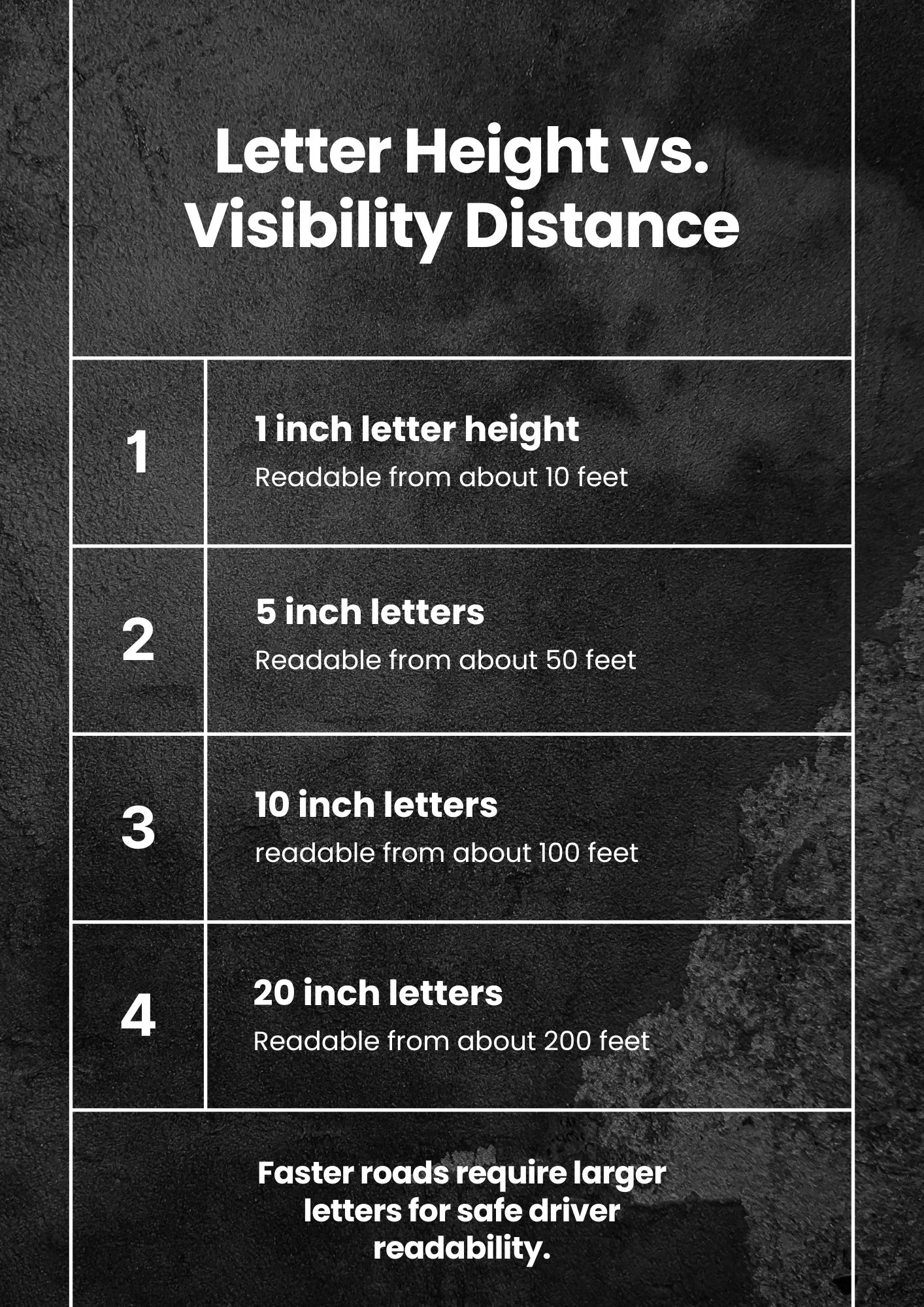
1 inch of letter height ≈ 10 feet of readability distance
Examples:
- 6-inch letters → readable from about 60 feet
- 10-inch letters → readable from about 100 feet
- 20-inch letters → readable from about 200 feet
Businesses located along major Sarasota roads such as U.S. Route 41, Bee Ridge Road, Clark Road, and Lakewood Ranch Boulevard must consider traffic speed when determining letter height.
Faster roads require larger lettering and simpler fonts to maintain readability.
This relationship between letter size and sign visibility distance is one of the most important principles in outdoor signage design.
Prioritize Contrast Over Style
Even the best fonts for storefront signs can fail if the color contrast is poor.
High-contrast combinations significantly improve readability. Examples include:
- Dark backgrounds with white lettering
- Navy with bright white text
- Black with yellow lettering
Low-contrast combinations — such as gray on white or beige on tan — often become unreadable in bright sunlight.
Florida’s intense sun can wash out subtle color differences, so high contrast signage is essential for maintaining visibility.
Florida-Specific Font Considerations
Designing signage in Florida introduces several environmental challenges.
Sun Glare
Bright sunlight can reduce contrast and create glare on sign surfaces. Thin strokes and delicate fonts become especially difficult to read under these conditions.
Bold lettering maintains visibility even when sunlight reflects off the sign face.
Coastal Exposure
Coastal environments expose signage to salt air, humidity, and constant UV radiation.
Over time, fading can reduce contrast and make thinner fonts disappear entirely. Choosing thicker lettering and durable materials helps maintain readability for years.
Signs designed for Florida sun exposure signs must anticipate this gradual fading.
Tourism & High Traffic
Sarasota’s traffic includes a large number of visitors who are unfamiliar with local businesses. These drivers rely on quick visual cues rather than brand recognition.
Simple, readable fonts communicate information faster than complex lettering. For tourism-heavy corridors, typography must be instantly recognizable.
Serif vs. Sans Serif — What Works Best for Sarasota Signs?
The debate between serif and sans serif fonts often comes up in sign design.
Sans serif fonts generally perform better for signage because they have:
- Cleaner lines
- Less visual clutter
- Better distance readability
Serif fonts — those with small decorative strokes at the ends of letters — can work in certain situations, especially when used in large, bold formats.
However, delicate serif styles should usually be avoided in outdoor signage.
For most Sarasota signs, bold sans-serif fonts provide the best balance of readability and durability.
Monument Signs vs. Pylon Signs — Font Adjustments Matter
Different sign types require different typography strategies.
Monument Signs
Monument signs are typically closer to the viewer and positioned near entrances. Because drivers may approach more slowly, designers have slightly more flexibility.
However, readability still matters, especially in busy plazas.
Pylon Signs
Pylon signs are designed for high visibility along major roads. Drivers often see them from farther away and at higher speeds.
For pylon sign readability:
- Letters must be larger
- Text should be minimal
- Fonts must be extremely clear
Most successful pylon signs use one bold font with very limited text.
Common Font Mistakes We See in Sarasota Business Signs
Many businesses unintentionally reduce their sign visibility by choosing the wrong typography.
Some of the most common mistakes include:
- Script fonts used for the primary business name
- Multiple font styles competing for attention
- Low contrast color combinations
- Letters that are too small for the road speed
- Overcrowded sign layouts
- Thin strokes that disappear at distance
- Poor letter spacing
These issues may seem minor individually, but together they can make a sign nearly unreadable from the road.
How Sarasota Sign Shop Designs for Maximum Readability
Effective signage design combines typography, materials, engineering, and visibility planning.
Sarasota Sign Shop approaches Sarasota signs with readability as the primary objective. Every design considers factors such as viewing distance, traffic speed, and sunlight exposure.
The process typically includes:
- In-house graphic design focused on readability
- Letter height calculations based on viewing distance
- Strategic spacing and layout adjustments
- Durable laminates to preserve color contrast
- Precision fabrication and professional installation
By considering these elements together, signage remains clear and effective for years.
Not Sure If Your Current Sign Font Is Working?
If customers drive past your location without noticing your business, the problem may be your sign’s typography.
Sarasota Sign Shop helps businesses evaluate their existing signage and redesign it for better visibility. Through design consultation, visibility audits, and professional fabrication, businesses throughout Sarasota, Lakewood Ranch, Bradenton, and Venice can improve how their signage performs on busy Florida roads.


