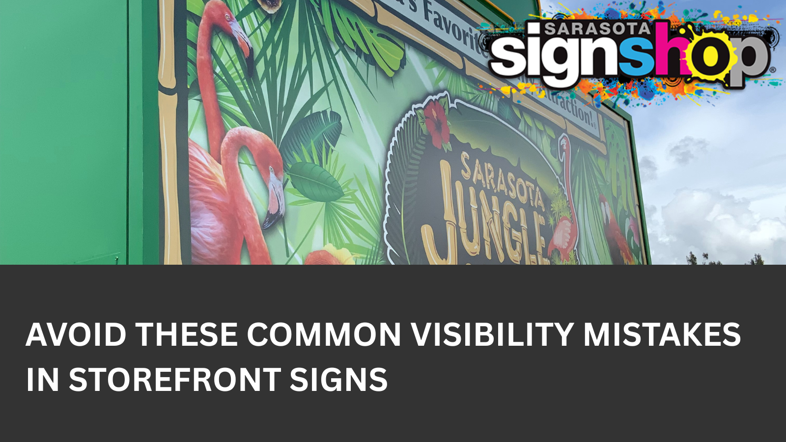
Your Sign Might Be the Problem
Many business owners assume a lack of customers is a marketing issue. In reality, the problem is often the sign itself. Visibility is one of the most important factors in sign performance. A sign can look attractive and still fail if people cannot read it quickly or notice it at all.
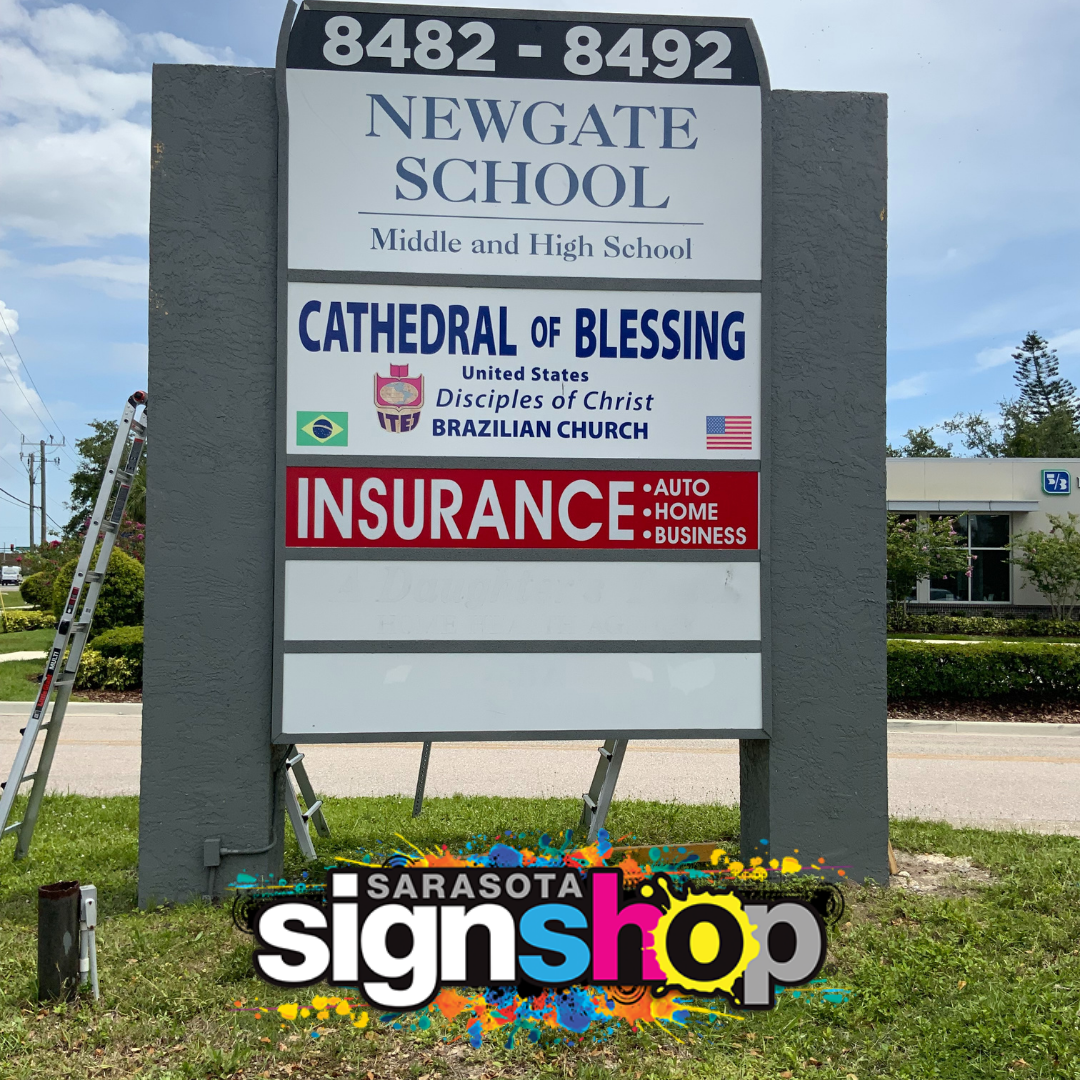
Storefront signs Sarasota businesses rely on face unique challenges. Bright sunlight, heavy traffic, palm trees, and mixed pedestrian and vehicle views all affect readability. A sign that works in another city may not perform well here. In this article, we cover the most common signage mistakes and explain how to avoid them so your storefront sign actually does its job.
Mistake #1 – Fonts That Look Nice But Do Not Read Well
Font choice is one of the most common sign design Sarasota mistakes. Script fonts and thin lettering may look stylish on a screen, but they are hard to read from a distance. Decorative fonts lose clarity quickly, especially when viewed at speed or in bright light.
For storefront signs Sarasota drivers and pedestrians must read quickly, clarity matters more than style. Bold, simple sans serif fonts perform best in most conditions. Proper spacing between letters also improves readability. Letters that are too close together blur when viewed from across the street.
Sarasota Sign Shop helps businesses balance branding with legibility. Designers test fonts at real viewing distances to confirm they stay readable. A sign that cannot be read easily is not doing its job, no matter how good it looks.
Mistake #2 – Poor Contrast Between Text and Background
Low contrast is another major issue that affects business sign visibility. Light text on a light background or dark text on a dark background makes signs difficult to read. This problem becomes worse in Sarasota sunlight, where glare can wash out colors.
High contrast color combinations improve readability. Black on white, white on black, or white on dark blue are reliable choices. Red on white or yellow on black can also work when done correctly. Adding outlines or subtle shadows can help separate text from the background.
Sarasota Sign Shop tests color combinations using realistic lighting conditions. Mockups are reviewed for daytime glare and changing light angles. This process helps avoid signage mistakes that only become obvious after installation.
Mistake #3 – Sign Too Small for Its Distance
Sign size must match viewing distance. A sign that looks fine up close may be unreadable from the road. This is a common problem for storefront signs Sarasota drivers need to see from intersections or busy streets.
A general rule is that one inch of letter height equals about ten feet of readable distance. If your sign is forty feet from the road, four inch letters are often the minimum. Foot traffic areas may allow smaller signs, but vehicle traffic requires larger lettering.
Zoning rules in Sarasota can limit sign size, which makes smart design essential. Sarasota Sign Shop understands how to maximize readability within local code limits. Proper sizing improves sign impact without risking permit issues.
Business owners often benefit from practical commercial signage tips that focus on real viewing conditions, not just design trends. Knowing how to improve sign visibility means thinking about both pedestrians and drivers at the same time. Signage for foot traffic and drivers must balance size, contrast, placement, and message length so it works at multiple speeds and distances. A sign that reads well up close but disappears from the road misses part of its audience. Planning for both viewing types from the start leads to stronger performance and fewer costly revisions later.
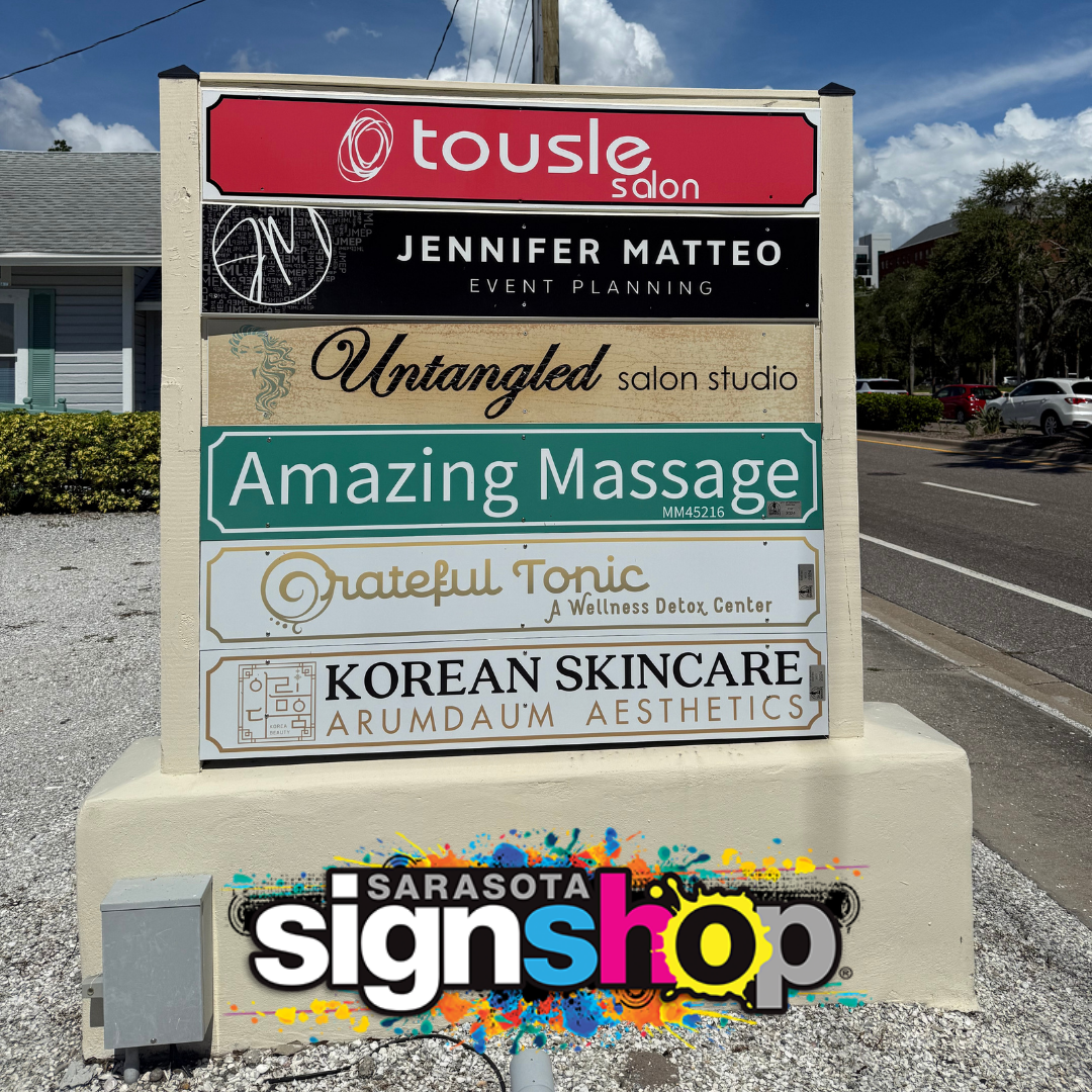
Mistake #4 – Cluttered Design with Too Much Text
Many businesses try to fit too much information on one sign. Phone numbers, taglines, services, and multiple colors compete for attention. The result is visual clutter that reduces clarity.
People do not stop to read storefront signs. They scan them. For drivers, the viewing window may only be a few seconds. The most effective custom storefront signs focus on the business name, logo, and a simple message.
Less text leads to better recall. Clean layouts guide the eye and improve recognition. Sarasota Sign Shop provides layout support that prioritizes clarity and balance. Every element on the sign must earn its place.
Mistake #5 – Bad Placement or Poor Viewing Angle
Even a well designed sign can fail if it is placed incorrectly. Signs may be blocked by awnings, trees, poles, or architectural features. Others are mounted too high, too low, or facing the wrong direction.
Storefront signs Sarasota businesses install should be evaluated from all approaches. How does the sign look to someone walking past? How does it look to drivers coming from each direction? Is it visible at intersections or hidden behind landscaping?
Sarasota Sign Shop performs site surveys before finalizing placement. The team reviews sightlines, traffic flow, and building features. This step helps ensure the sign is seen when and where it matters.
Mistake #6 – Poor Lighting or No Lighting at All
A sign that works during the day may disappear at night. Poor lighting is a major visibility issue for many Sarasota signs. Unlit signs rely on street lighting, which is often inconsistent or blocked.
Backlit signs and properly placed external lighting improve nighttime readability. LED lighting provides even illumination and long service life. Poorly designed lighting can cause glare, shadows, or uneven brightness.
Sarasota Sign Shop offers lighting consultations as part of the sign design process. Options include internally illuminated signs, halo lighting, and external fixtures. The goal is consistent visibility from dusk through night without harsh glare.
How Sarasota Sign Shop Solves These Problems
Sarasota Sign Shop designs, fabricates, and installs signs in house. This allows better control over quality, timing, and performance. The team includes experienced designers, printers, and installers who work together from start to finish.
Services include visibility reviews, design mockups, permitting support, and lighting planning. Local knowledge helps account for Sarasota traffic patterns, sun exposure, and zoning rules. Each project is approached with real world conditions in mind.
By handling every step internally, Sarasota Sign Shop reduces common signage mistakes and delivers signs that look good and perform well.
Make Sure Your Sign Works as Hard as You Do
Your storefront sign is often the first impression of your business. When visibility problems are fixed, signs attract more attention, improve recognition, and support daily sales. Avoiding common mistakes can lead to more walk ins and stronger brand presence.
Sarasota Sign Shop helps businesses across Sarasota, Venice, Lakewood Ranch, and Bradenton create signs that work in real conditions. Book a free sign consultation to review your current signage or plan a new one. Call (941) 377 8259, request a quote online, or visit the Sarasota location to get started.