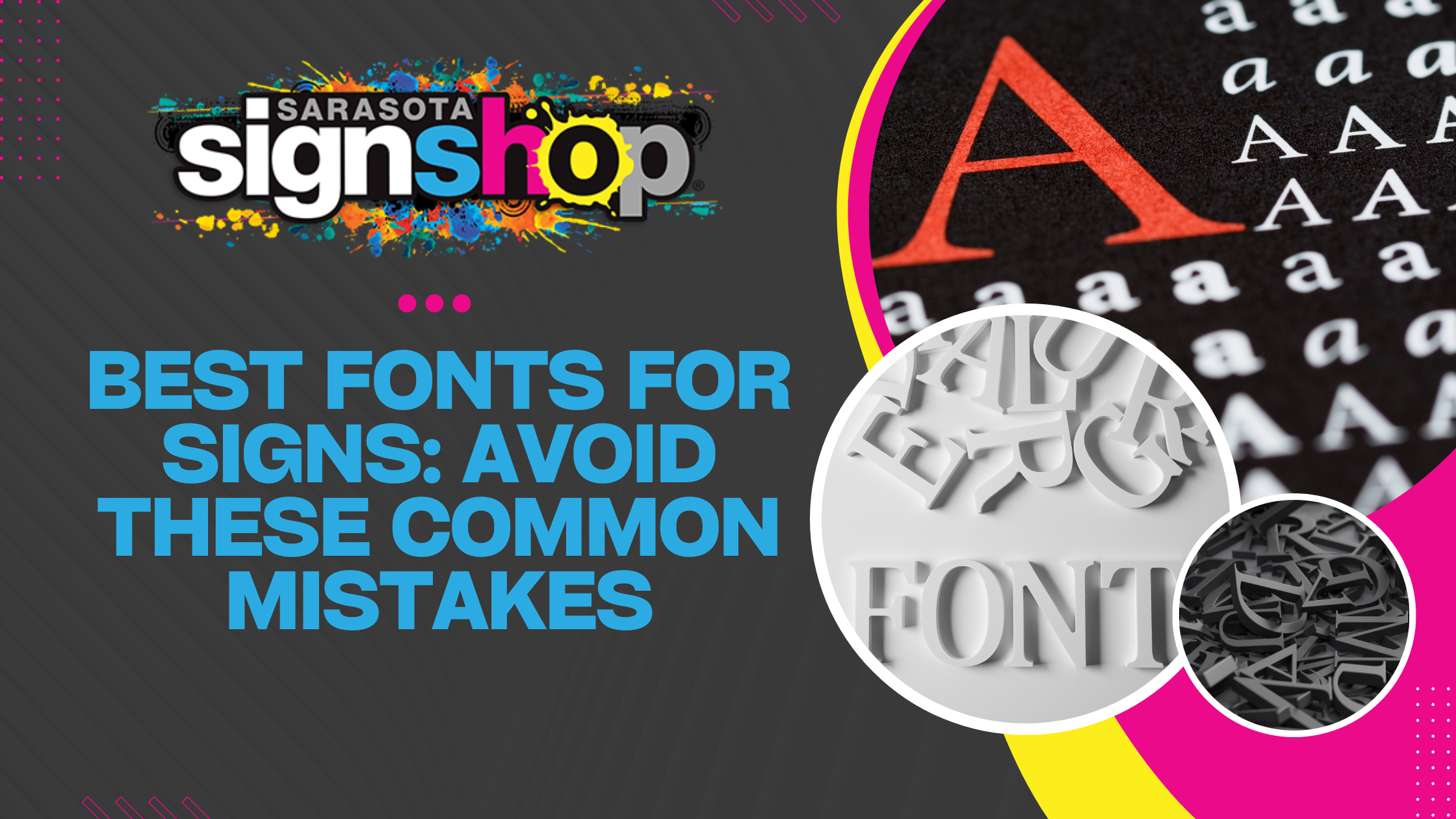
Choosing the best fonts for signs is crucial for readability, branding, and effectiveness. A poorly chosen font can make a sign hard to read, unprofessional, or even completely ineffective.
This article covers the most common font mistakes in signage and how to avoid them. Whether you’re designing storefront signs, real estate signs, or directional signage, these tips will help ensure your message stands out.
1. Choosing Fonts That Are Hard to Read
Signs need to be readable at a glance. Fonts that are too thin, overly decorative, or script-based can be difficult to read from a distance.
Avoid these:
- Script fonts like Lobster or Brush Script (too decorative)
- Thin fonts like Bodoni (hard to see from afar)
- Novelty fonts like Papyrus or Comic Sans (unprofessional)
Better options:
- Helvetica – clean and widely used for signage
- Futura – modern and easy to read
- Impact – bold for maximum visibility
Legibility should always come first when choosing the best fonts for signs.

2. Using Too Many Fonts with Signage
Mixing multiple fonts can create a cluttered, inconsistent look. A good rule of thumb is to stick to two fonts—one for headlines and one for body text.
Bad examples:
- Using more than two fonts on one sign
- Pairing fonts with conflicting styles (e.g., a script font with a futuristic font)
Best practice:
- Use a strong, bold font for headlines and a simpler font for secondary text
- Stick to complementary fonts, like Montserrat and Lato
Consistency makes signs look professional and easy to read.
3. Ignoring Font Size and Spacing
Size matters. If your font is too small, people won’t be able to read it from a distance. If spacing is off, words can blend together.
Key guidelines:
- 1-inch letter height per 10 feet of distance (Source: USSC)
- Proper kerning (space between letters) improves readability
- Line spacing should allow clear distinction between words
Small or cramped fonts reduce effectiveness. Make sure your text is large and well-spaced.
4. Poor Contrast Between Font and Background
Low-contrast text is hard to read, especially outdoors.
Common mistakes:
- Light-colored text on a white or pastel background
- Dark text on a dark background
- Using busy patterns behind text
Best color combinations for readability:
- Black on white (or vice versa)
- Yellow on black
- Blue on white
If contrast is low, add a subtle outline or drop shadow for better visibility.

5. Not Considering the Purpose and Brand Identity
Fonts send a message. A law firm shouldn’t use a playful handwritten font, and a children’s daycare shouldn’t use a rigid corporate font.
Examples:
- Professional businesses: Use serif font or clean sans-serif fonts (Times New Roman, Garamond, Arial)
- Creative or fun brands: Rounded, playful fonts like Poppins or Raleway
- Industrial and bold brands: Blocky, strong fonts like Impact or Oswald
Choosing the best fonts for signs means picking a style that reflects the brand’s personality.
6. Forgetting About Material and Lighting Conditions
Not all fonts work on every surface. Consider how the font will look when printed on different materials or viewed under various lighting conditions.
Key factors:
- Glossy surfaces may reflect light and make thin fonts harder to see
- Backlit signs need bold fonts with strong contrast
- Engraved signs require deeper letter spacing for legibility
Test fonts in real conditions before finalizing a design.
7. Choosing Trendy Fonts That Don’t Age Well
Trendy fonts might look good today but could feel outdated in a few years. A sign is an investment—choose fonts that will stand the test of time.
Examples of fonts that aged poorly:
- Lobster (overused in DIY design)
- Papyrus (overused and unprofessional)
- Bleeding Cowboy (used in too many Western-themed designs)
Timeless fonts for signage:
- Helvetica – A classic used by major brands
- Futura – Clean, geometric, and modern
- Arial Bold – Simple and easy to read
Stick with fonts that will remain effective for years.
8. Statistics & Expert Insights on Effective Eye-Catching Fonts for Business Signs

Data supports the importance of using the best fonts for signs. Here are some key insights:
- Simple, bold fonts improve readability by up to 60%. (Source: International Journal of Design)
- For every 10 feet of viewing distance, letters should be at least 1 inch tall. (Source: USSC)
- High-contrast colors improve sign visibility by 83%. (Source: Sign Research Foundation)
- 76% of consumers entered a business for the first time based on its signage. (Source: FedEx Signage Report)
- 60% of businesses saw an increase in sales after updating their signage. (Source: SBA)
Effective signage makes a measurable impact. Choosing the right font is a critical part of that success. Consider a graphic designer to help you make the right decision.
Why Sarasota Sign Shop is the Best Choice For Branding and Design
At Sarasota Sign Shop, we understand that the right signage can make or break a business. We specialize in creating high-quality, professional signs that are not only visually appealing but also highly readable, durable, and impactful.
Why choose us?
- Expert Design Assistance: We help you select the best fonts for signs that maximize readability and reflect your brand.
- State-of-the-Art Printing: We use eco-friendly HP latex printers with water-based inks for a sustainable, vibrant finish.
- Custom Solutions: From storefront signs to real estate and directional signage, we tailor each design to your needs.
- Durability & Quality: Our materials and printing methods ensure your signs withstand the elements.
- Fast Turnaround & Local Service: We provide quick, high-quality service to help your business stand out.
Your signage is one of the first impressions customers have of your business. Make it count with Sarasota Sign Shop.
📞 Contact us today to get started on your perfect sign!